How to read forex charts for beginners
Learning how to read forex charts is one of the first steps you’ll need to take as a beginner in trading. We explain how you can read some of the main types of forex charts and more in this guide.
TRADING FOREX USING CHARTS
Most technical analysts will tell you that chart-based strategies can work for any market as long as there is price action to analyze. While forex is no different, understanding the characteristics of the FX market and how it is charted can help beginner traders looking to get started trading forex using charts and technical analysis.
WHAT'S ON THIS PAGE?
1. What is a forex chart?
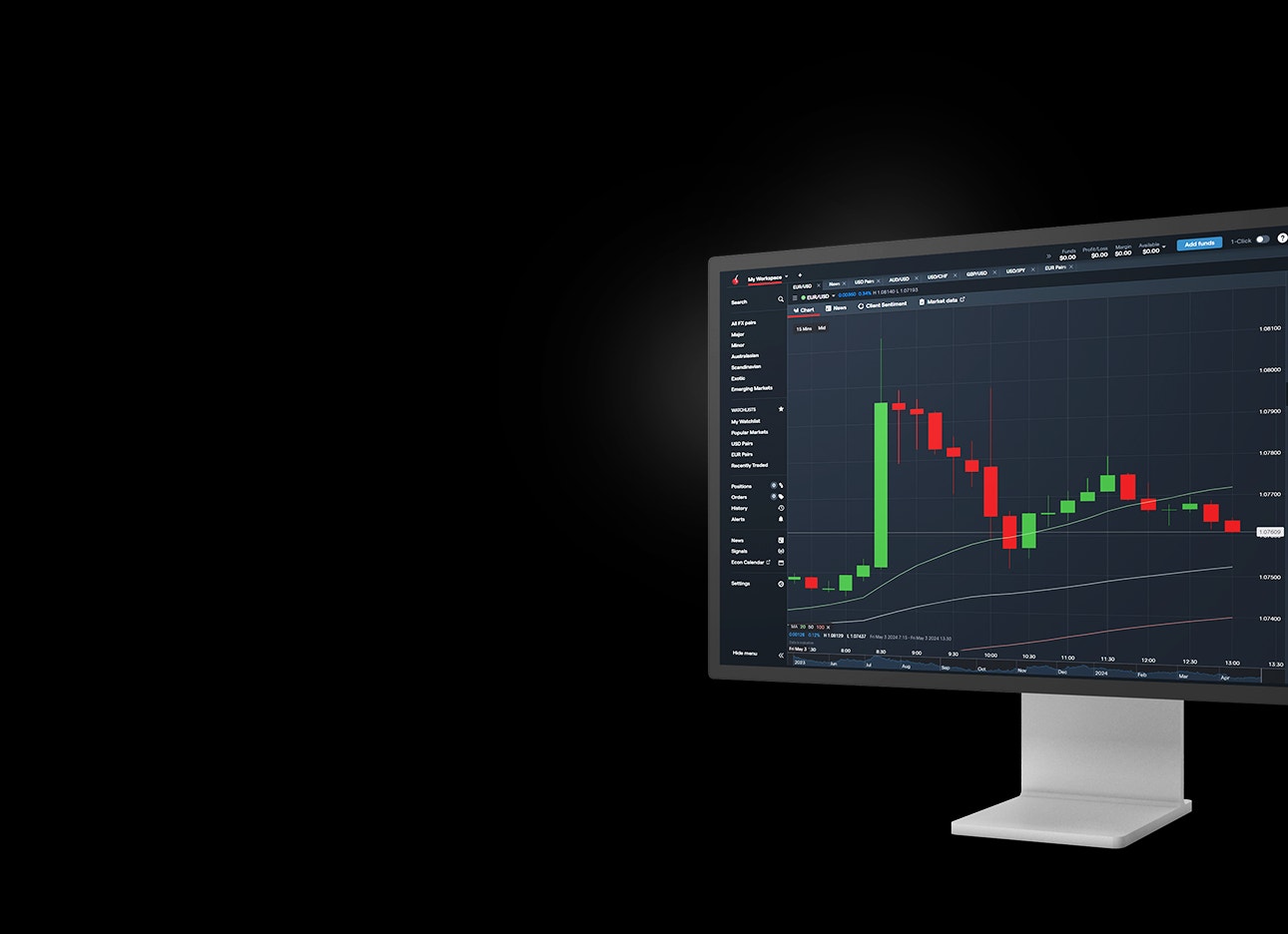
A forex chart is a graphical representation showing how the price of one currency has changed in relation to another currency over time. The price of the currency pair is plotted on the vertical y-axis, while the horizontal x-axis shows time.
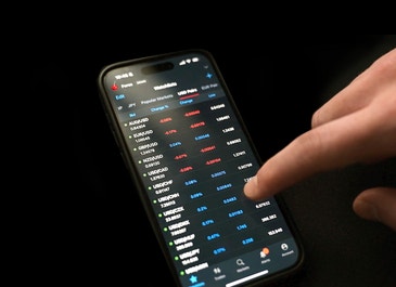
On our trading platforms, you can choose how frequently new data is plotted to a chart by selecting your preferred timeframe, ranging from tick-by-tick to a whole month.
2. How to read a forex chart
Understanding how to read a forex chart is essential in increasing your probability of success and limiting risk in trading currency pairs.
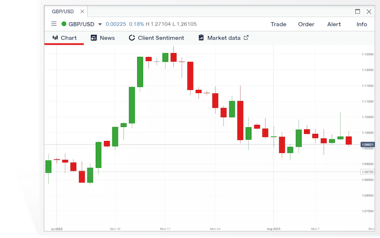
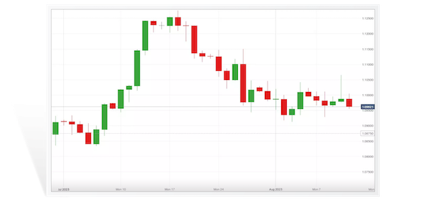
Let’s take the GBP/USD currency pair as an example using the below graphic. Here’s the information that you’ll be able to read from the chart:
- Currency pair: the asset name shows the ‘base’ currency (pound) first, and the ‘quote’ currency (dollar) second
- Price: the price of the base currency in relation to the quote currency—ie, how many dollars you’d pay to buy one pound—is on the y-axis
- Timeframe: the customizable chart period is on the x-axis
PIPS ON FOREX CHARTS
Pips on forex charts are also knows as ‘ticks’—they’re the smallest possible change in price movement of a currency pair. Pip stands for ‘point in percentage’—this refers to minimum standard change in the quote currency. For example, if the price of GBP/USD moves from 1.4190 to 1.4191, the 0.0001 rise in value of the USD represents a single pip.
FOREX CHART TIME INTERVALS
You can view the current performance of a currency pair’s price, or you can select a certain period to see how it has changed over time, which can be anything from ticks, seconds, minutes and hours to days, weeks and months.
3. Types of forex charts
The type of forex chart you choose to use depends on personal preference and the level of detail you want displayed. Some popular types of charts include candlestick, Heikin-Ashi, HLOC, line and mountain, each of which read in a different way. Let’s take a closer look at these chart types:
CANDLESTICK CHART
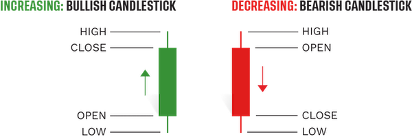
Candlestick charts display pricing information in long, thin bars that resemble candles.
Each candlestick shows price movement over the period you selected. For example, if you chose a 15-minute timeframe, each candlestick on the chart will show how prices developed over a 15-minute period; the only exception being the candlestick on the far right of the chart, which will show live prices for the current—incomplete—15-minute period.
At a glance, a green candlestick indicates that the pair moved up in price over the given period, closing at a higher price than the one at which it opened. A red candlestick, on the other hand, indicates that the pair’s price decreased, closing at a lower price than the one at which it opened.
Each candlestick will show four specific prices for the currency pair:
- Open: the price at the start of the period
- Close: the price at the end of the period
- High: the highest price traded during the period
- Low: the lowest price traded during the period
The relationship between the four prices shown by a candlestick can tell you a great deal about how market conditions are shaping up and who is driving the price action: buyers or sellers.
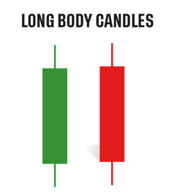
Long green candlesticks may indicate that there’s a lot of buying pressure, while long red candlesticks may indicate a lot of selling pressure.
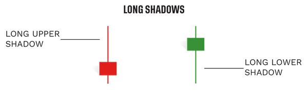
Candlesticks with long wicks and short bodies, on the other hand, indicate that there was considerable pressure in one direction, but that the price was pushed back before the end of that period.
DOJIS
Occasionally, the opening and closing prices are equal (or very close together), creating a black cross known as a ‘doji’. This is indicative of indecision in the market, with neither buyers nor sellers able to assert enough influence over the direction of price movements.
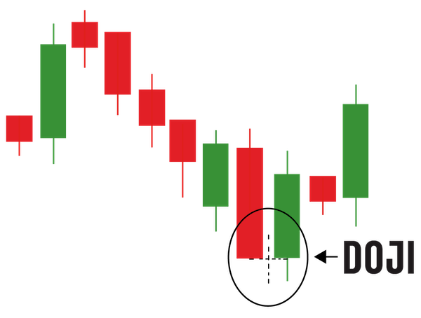
Taken on its own, a doji is a neutral pattern of little significance. However, if a doji forms within an uptrend or downtrend, it may indicate that a reversal is on the way.
Learn more about chart patterns
HEIKIN-ASHI
A Heikin-Ashi style chart is a type of candlestick chart. Heikin-Ashi is a Japanese term that roughly translates to ‘average pace’ or ‘average bar’ – this type of chart depicts price averages as well as their changes (up or down) over a certain period. A long green bar indicates a significant increase in average price, whereas a long red bar shows a sharp decrease in the average price.
While it may look like the traditional candlestick chart, Heikin-Ashi charts differ quite significantly in several ways. For example, they’re smoother than candlesticks as they show general trends, instead of exact prices. Additionally, the opening price of each bar is the mid-point of the previous bar, and a bar’s closing price is the average price for the period it spans.
HLOC CHART
An HLOC chart (also called a bar chart), which stands for ‘high, low, open, close’, shows exactly the same data as a candlestick chart, but in a different way:
- The open price is represented by the notch to the left of the vertical line
- The close price is represented by the notch to the right of the vertical line
- The high price is the uppermost point of the vertical line
- The low price is the lowest point of the vertical line
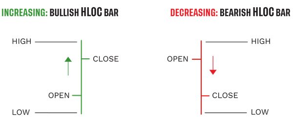
Once again, the line will be green if the currency pair moved up in price over the given period, closing at a higher price than it opened. Conversely, it’ll be red if the pair’s price decreased over the given period, closing at a lower price than it opened. It’s possible for dojis to form when the open and close prices are equal.
LINE CHART
A line chart only shows the close price for the time period you have selected (eg one hour). The close prices are joined together so that the consecutive points form a line.
This is a very simple way to display pricing data as it doesn’t give any indication of what the high, low or open price for the period was. For this reason, many forex traders only use line charts when assessing long-term trends, where some of the additional information may not be quite as relevant as it is when trading short-term patterns.
MOUNTAIN CHART
A mountain chart is the same as a line chart, except the area beneath the line is shaded, giving it the appearance of a mountain in silhouette. Like line charts, this type is mainly used to assess long-term trends, as the high, low and open prices for each period aren’t on show.
4. What are forex indicators?
Forex indicators are overlays that you can add to charts – they represent mathematical calculations that can help you identify market signals and trends. While indicators can be helpful to use as part of your technical analysis, it’s just one of the ways of strengthening your trading plan and decision-making.
Let’s look at some of the most popular indicators used in forex trading.
1. MOVING AVERAGE
Also known as the simple moving average (SMA), moving averages are a popular indicator that calculates the average price over a specific time period. It helps traders identify trends and potential support and resistance levels. MAs can provide support or resistance on their own, but many traders use two or more to identify crossovers - crossovers being the intersection of two MAs with different time horizons.
2. MOVING AVERAGE CONVERGENCE DIVERGENCE (MACD)
The MACD indicator uses two exponential moving averages of different timeframes to identify the strength of a directional move. This line is compared to a signal line that is an EMA of the MACD line. If the MACD line is above the signal line, the histogram will indicate bullish momentum; a signal line higher than the MACD then indicating bearish momentum. Traders can conversely use the histogram to gauge if a pair is overbought/oversold.
3. RELATIVE STRENGTH IDEX (RSI)
The RSI measures the strength and speed of price movements. It is a momentum indicator that attempts to highlight overbought or oversold levels. Like Stochastic Oscillator, RSI is bound by 0 and 100, but traders tend to anticipate potential trend reversals at levels below 30 or above 70.
4. STOCHASTIC OSCILLATOR
The stochastic oscillator measures the current price relative to its price range over a specific time period. Its values are bound between 0 and 100 - many traders anticipate a trend reversal when this indicator is under 20 or over 80.
5. What is technical analysis?
Technical analysis involves studying historical chart patterns and formations to predict the future direction of a market’s price—for example, looking at the relationship between consecutive candlesticks or HLOC bars. While this guide has introduced the basic concepts you need to know to read forex charts, many experienced traders use more advanced technical analysis to forecast price movements.
6. How to access forex charts
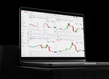
You can access forex charts for free on our platform. You can use your live account to access forex charts and take a position, or you can view charts and practice your forex trading on our demo account for free, without using any real capital.
HOW TO OPEN AN ACCOUNT
You can open a live trading account and start trading forex in these steps:
Fill in a simple form: we’ll ask about your trading knowledge to ensure you get the best experience, and review required documentation
Get verification: it'll usually take a couple days to verify your identity
Fund your account and start trading: you can also withdraw your money easily, whenever you like