How to read forex charts
What is a forex chart?
A forex chart is a graphical representation showing how the price of a currency pair changes over time.
The price is plotted on the vertical y-axis, while the horizontal x-axis shows time. On tastyfx’s trading platforms, you can choose how frequently new data is plotted to a chart by selecting a timeframe, ranging from tick-by-tick to a whole month.
How to read different types of forex charts
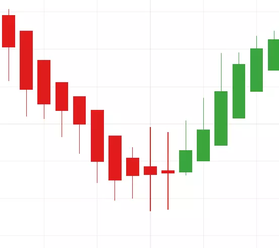
Candlestick chart
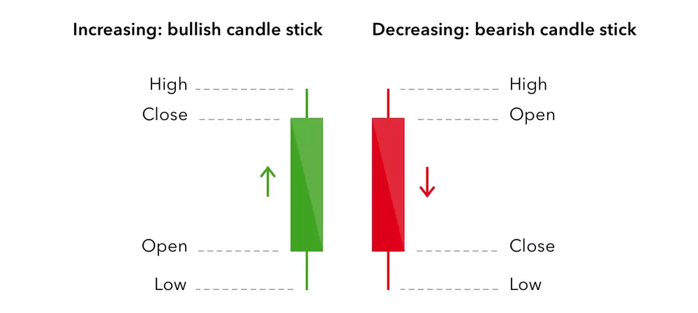
Candlestick charts display pricing information in long, thin bars that resemble candles.
Each candlestick shows price movement over the period of time you selected. For example, if you have chosen a 15-minute timeframe, each candlestick on the chart will show how prices developed over a 15-minute period; the only exception being the candlestick on the far right of the chart, which will show live prices for the current – incomplete – period.
At a glance, a green candlestick indicates that the pair moved up in price over the given period, closing at a higher price than it opened. A red candlestick, on the other hand, indicates that the pair’s price decreased, closing at a lower price than it opened.
In addition, each candlestick will show four specific prices for the currency pair:
- Open: the price at the start of the period
- Close: the price at the end of the period
- High: the highest price traded during the period
- Low: the lowest price traded during the period
The relationship between the four prices shown by a candlestick can tell you a great deal about how market conditions are shaping up and who is driving the price action: buyers or sellers.
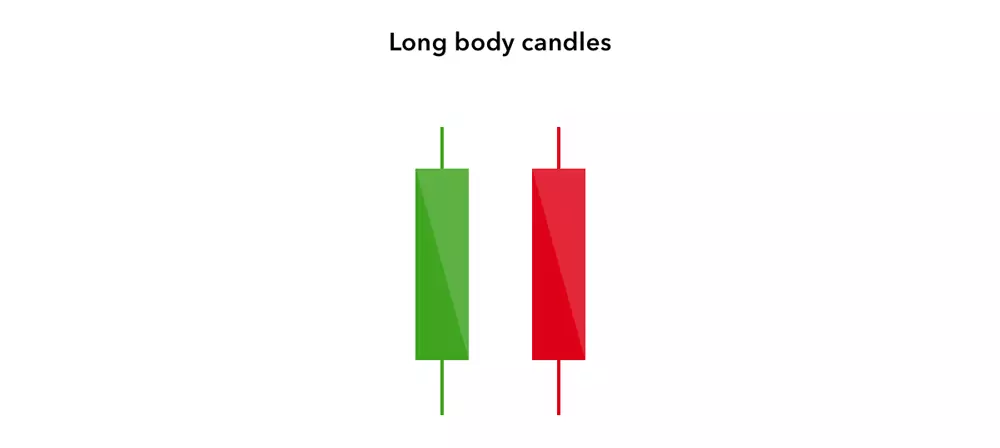
Long green candlesticks may indicate that there is a lot of buying pressure, while long red candlesticks may indicate a lot of selling pressure.
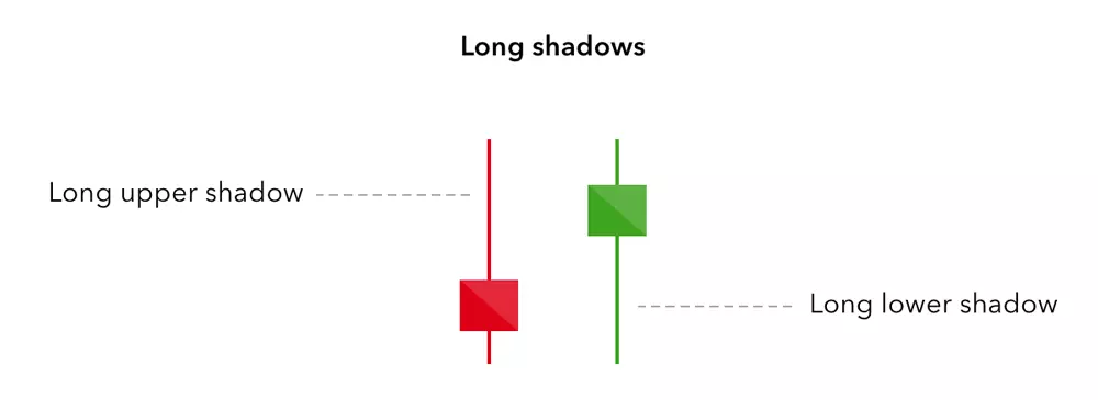
Candlesticks with long wicks but short bodies, on the other hand, indicate that there was considerable pressure in one direction, but that the price was pushed back before the end of that period.
Dojis
Occasionally, the opening and closing prices are equal (or very close together), creating a black cross known as a ‘doji’. This is indicative of indecision in the market, with neither buyers nor sellers able to assert sufficient influence over the direction of price movements.
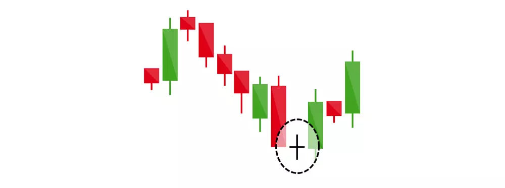
Taken on its own, a doji is a neutral pattern of little significance. However, if a doji forms within an uptrend or downtrend, it may indicate that a reversal is on the way. To learn more about chart patterns, join tastyfx Learn Center.
Heikin-Ashi chart
Heikin-Ashi charts are similar to candlesticks, except the bars are calculated using averages instead of direct prices. The open price is the midpoint of the previous bar, and the close is the average price of the current bar.
Averaging connects the candlesticks more smoothly which can make long-term trends easier to read. However, traders often use this type of chart to accompany traditional candlesticks since the bars are not indicative of true open and close prices.
HLOC chart (also called a bar chart)
The next type of chart, HLOC, which stands for ‘high, low, open, close’, shows exactly the same data as a candlestick chart, but in a different way:
- The open price is represented by the notch to the left of the vertical line
- The close price is represented by the notch to the right of the vertical line
- The high price is the uppermost point of the vertical line
- The low price is the lowest point of the vertical line
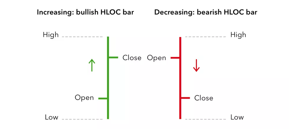
Once again, the line will be green if the currency pair moved up in price over the given period, closing at a higher price than it opened, and red if the pair’s price decreased over the given period, closing at a lower price than it opened. It’s possible for dojis to form when the open and close prices are equal.
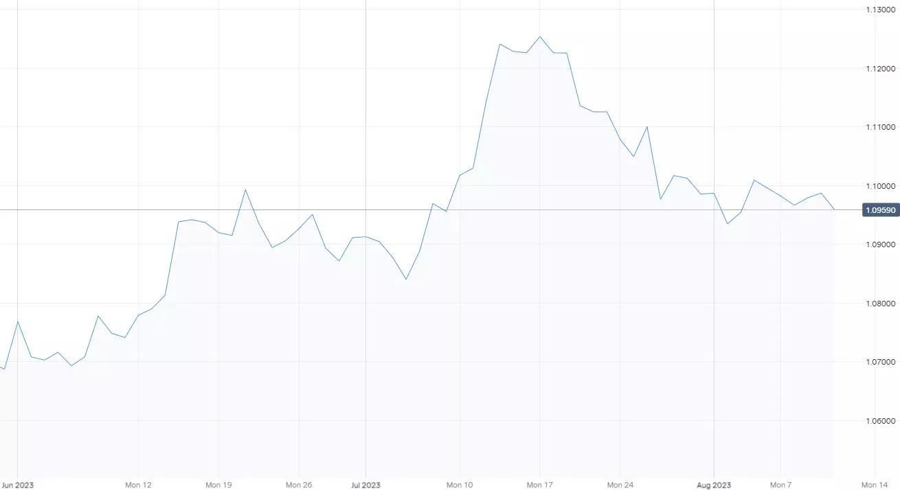
Line chart
Unlike a candlestick or HLOC chart, a line chart only shows the close price for the time period you have selected (eg one hour). The close prices are joined together so that the consecutive points form a line.
This is a very simple way to display pricing data as it does not give any indication of what the high, low or open price for the period was. For this reason, many forex traders only use line charts when assessing long-term trends, where some of the additional information may not be quite as relevant as it is when trading short-term patterns.
Mountain chart
The final type of chart is a mountain chart. This is the same as a line chart, except the area beneath the line is shaded, giving it the appearance of a mountain in silhouette. Like line charts, this type is mainly used to assess long-term trends, as the high, low and open prices for each period are not on show.
Using technical analysis to forecast FX prices
While this guide has introduced the basic concepts you need to know to read forex charts, many experienced traders use more advanced technical analysis to forecast price movements.
Technical analysis involves studying historical chart patterns and formations to predict the future direction of a market’s price – for example, looking at the relationship between consecutive candlesticks or HLOC bars. Find out more about technical analysis.
Practice trading forex using charts
- Open an account to get started, or practice on a demo account
- Choose your forex trading platform
- Monitor pairs using different chart types
- Open and close positions on forex pairs
Trading forex requires an account with a forex provider like tastyfx. Many traders watch major forex pairs like EUR/USD and USD/JPY, which can be found in tastyfx's platform under the 'Major' pairs tab, for potential opportunities based on economic events such as inflation releases or interest rate decisions. Economic events can produce more volatility for forex pairs, which can mean greater potential profits and losses as risks can increase at these times.
You can help develop your forex trading strategies using resources like tastyfx’s Learn Center. Once your strategy is developed, you can follow the above steps to opening an account and getting started trading forex.
Your profit or loss is calculated according to your full position size. Leverage will magnify both your profits and losses. It’s important to manage your risks carefully as losses can exceed your deposit. Ensure you understand the risks and benefits associated with trading leveraged products before you start trading with them. Trade using money you’re comfortable losing.
This information has been prepared by tastyfx, a trading name of tastyfx LLC. This material does not contain a record of our trading prices, or an offer of, or solicitation for, a transaction in any financial instrument. You should not treat any opinion expressed in this material as a specific inducement to make any investment or follow any strategy, but only as an expression of opinion. This material does not consider your investment objectives, financial situation or needs and is not intended as recommendations appropriate for you. No representation or warranty is given as to the accuracy or completeness of the above information. tastyfx accepts no responsibility for any use that may be made of these comments and for any consequences that result. See our Summary Conflicts Policy, available on our website.