Top 10 TradingView indicators for forex trading
Explore how trading indicators on TradingView empower traders with tools to analyze trends, set strategic entry/exit points, and gauge market dynamics using top indicators like RSI, MACD, and Bollinger Bands.
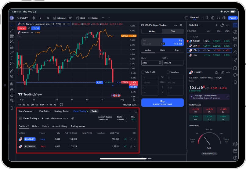
What is a trading indicator?
A trading indicator is a tool used by traders to analyze and interpret market data, typically presented in the form of price action or volume, to help make informed trading decisions. Trading indicators are usually displayed as graphical representations on price charts and are based on mathematical calculations. These indicators are aspects of technical analysis that can help identify market trends, determine entry and exit points, evaluate market volatility, and potentially predict future price movements. Now that we are offered on TradingView, you have even more opportunities to use these indicators to enhance your trading experience.
Top 10 TradingView indicators
- Relative Strength Index
- Moving Average Convergence Divergence (MACD)
- Bollinger Bands
- Fibonacci Retracement
- Average True Range
- Stochastic Oscillator
- Ichimoku Cloud
- Volume Profile
- Pivot Points
- Moving Average
1. Relative Strength Index (RSI)
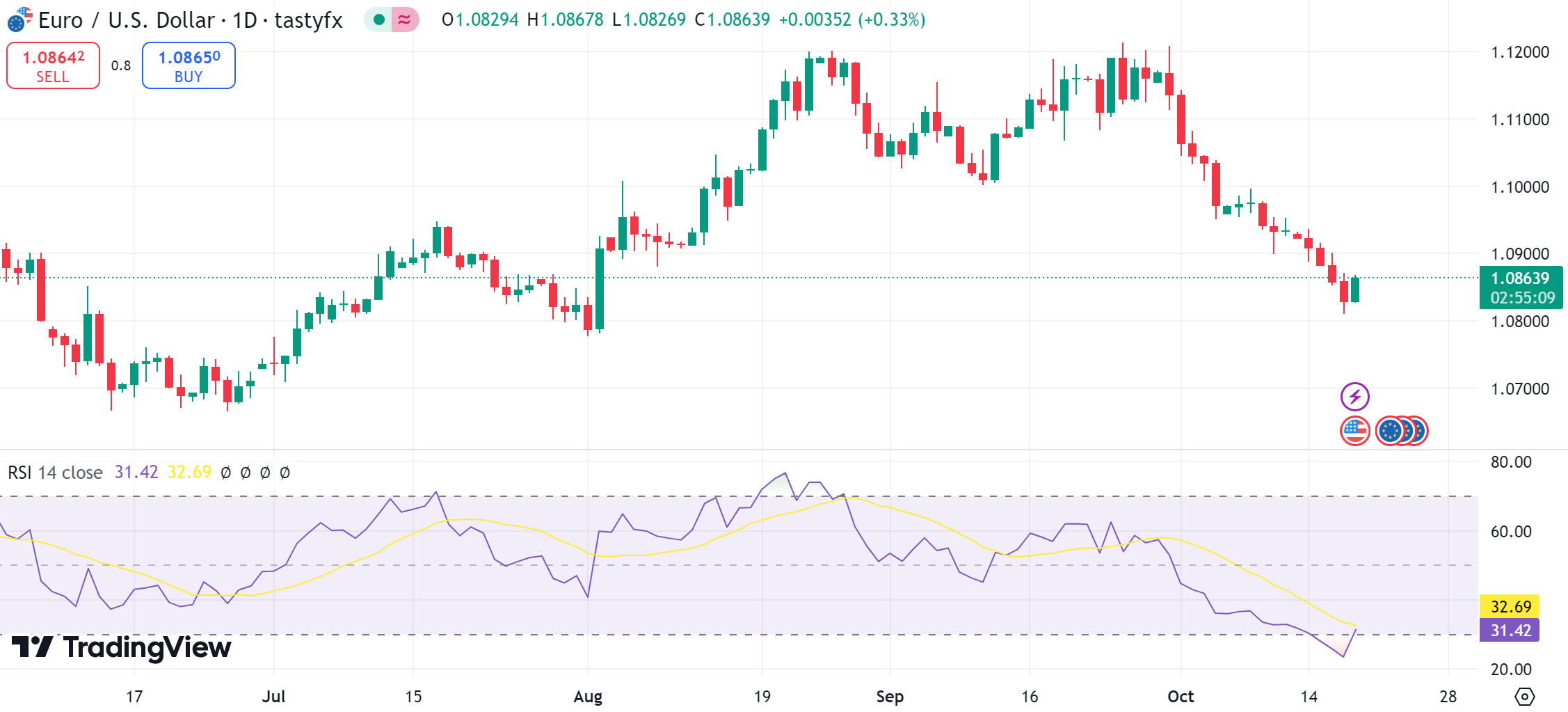
RSI measures the magnitude of recent price changes to identify overbought or oversold conditions.
What is it used for?
Traders use the RSI to identify buying or selling opportunities based on overbought/oversold conditions, trend strength, and potential price reversals. It is most effective in conjunction with other indicators and analysis techniques to confirm market signals.
How is it represented?
RSI is calculated using the formula: RSI = 100 – (100/1+RS) where RS (Relative Strength) is the average gain of up movements divided by the average loss of down movements over a specified period, typically 14 periods.
How is it interpreted?
Traditionally, RSI values above 70 indicate that a security might be overbought, while values below 30 suggest it might be oversold. These levels can signal potential reversal points in the market. The midpoint of the RSI is 50. Readings above 50 generally suggest that the security is in an uptrend, while readings below 50 indicate a downtrend.
2. Moving Average Convergence Divergence (MACD)
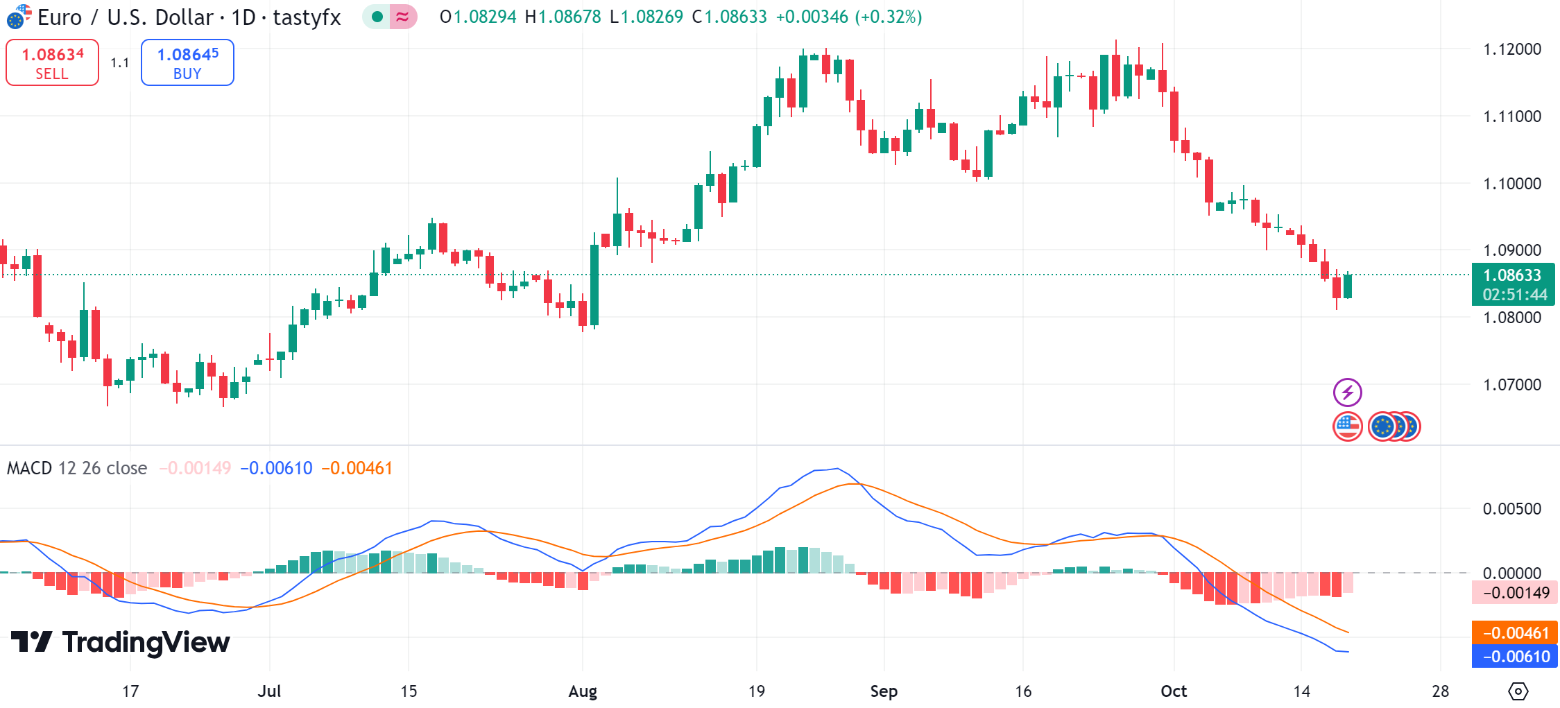
MACD is a trend-following momentum indicator that shows the relationship between two moving averages of a security's price.
What is it used for?
The MACD helps traders identify the strength and direction of a trend. However, as with any indicator, it is often used alongside other technical analysis tools to confirm market signals and improve the accuracy of trading decisions.
How is it represented?
The MACD is calculated using three main components:
MACD Line: This is determined by subtracting a longer-term exponential moving average (EMA) from a shorter-term EMA. It shows the difference between these two moving averages and indicates momentum in the market.
Signal Line: The signal line is an EMA of the MACD line itself. It serves to smooth out fluctuations and aids in identifying trends.
Histogram: This component represents the difference between the MACD line and the Signal line. It visualizes the degree to which the two lines are diverging or converging, providing insight into momentum shifts.
In essence, the MACD helps traders identify potential buy and sell signals when the MACD line crosses above or below the Signal line. The histogram further aids by showing the strength and direction of the movement.
How is it interpreted?
When the MACD Line is above the zero line, it indicates a potential bullish trend, while a MACD Line below the zero line suggests a potentially bearish trend.
3. Bollinger Bands
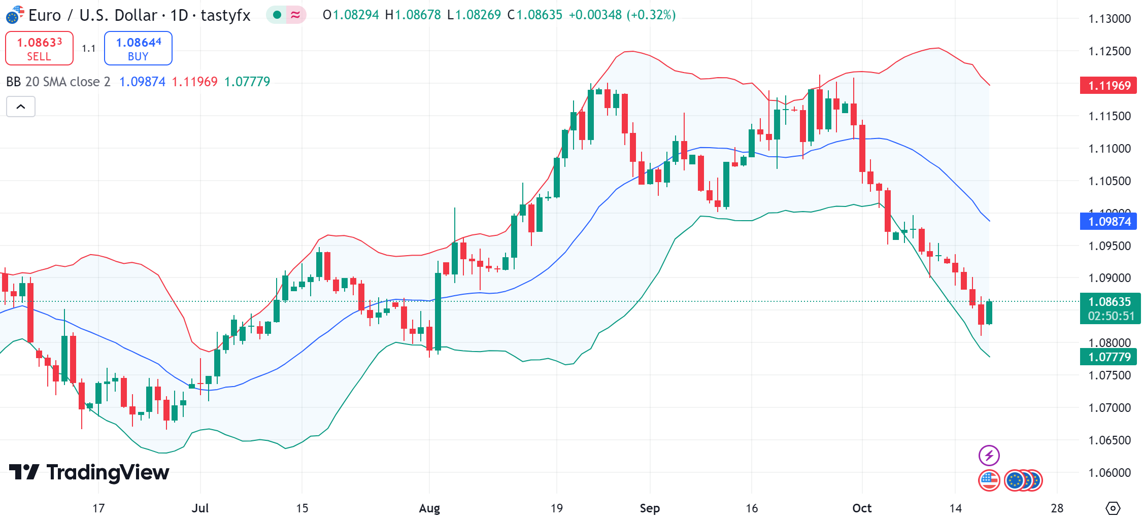
Bollinger Bands are a technical analysis tool used in trading to measure market volatility and identify potential overbought or oversold conditions.
What is it used for?
Bollinger bands used for several purposes, but its most common ones include assessing market volatility, identifying overbought/sold conditions, and trend/reversal signals.
How is it represented?
Bollinger Bands are represented on a price chart as three lines that move along with the price. First, there is the middle band, a base single line that follows the price trend and represents the simple moving average (SMA) over a set number of periods (typically 20. Then, there is the upper band, plotted above the middle line that shows the specified number of standard deviations above the SMA. It represents the higher limit of expected price movement. Finally, there’s the lower band, plotted below the middle band, representing the lower limit of expected price movement. These bands form an "envelope" around the price movements, expanding and contracting based on market volatility.
How is it interpreted?
Bollinger Bands are interpreted in various ways to aid traders in making informed decisions. Key interpretations include:
Volatility Indication: When the bands widen, it suggests increased market volatility, while narrowing bands indicate reduced volatility.
Overbought and Oversold Conditions: If the price touches or moves above the upper band, the market might be considered overbought, signaling a potential selling opportunity. If the price touches or moves below the lower band, it might be seen as oversold, signaling a potential buying opportunity.
Trend Following: A strong upward trend can be indicated when prices consistently touch the upper band. A strong downward trend may be suggested when prices consistently touch the lower band.
Reversal Signals: When prices move outside the bands and then re-enter, it can suggest a potential reversal of the current trend.
4. Fibonacci Retracement
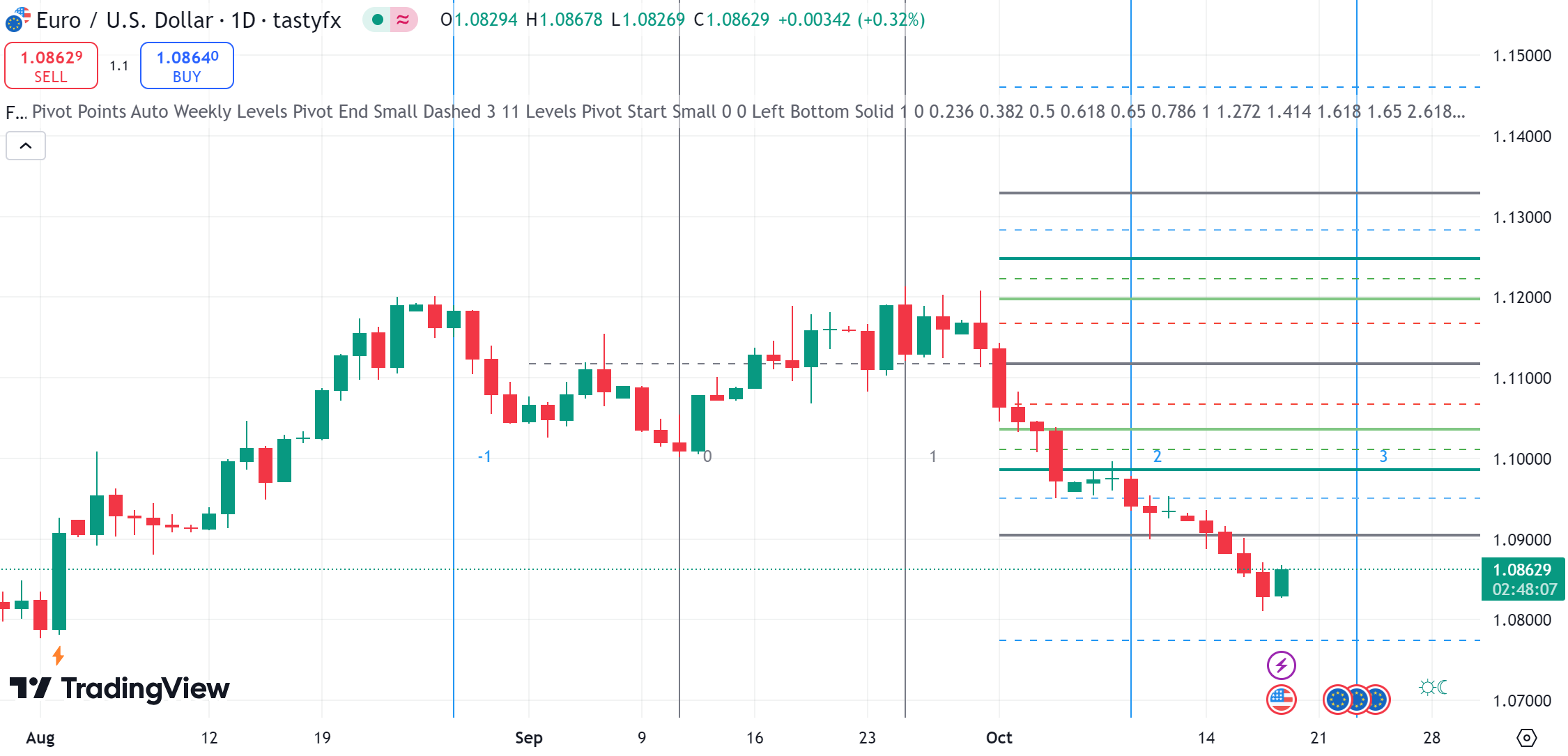
Fibonacci Retracement is used to identify potential support and resistance levels in a market. It is based on the idea that markets will retrace a predictable portion of a move, after which they might continue to move in the original direction.
What is it used for?
Traders use Fibonacci retracement levels to determine potential entry and exit points by identifying areas where an asset's price may experience a significant pullback before resuming its trend.
How is it represented?
It uses horizontal lines to indicate areas where the price might find support or resistance and is derived from the Fibonacci sequence. The key Fibonacci levels, often used by traders, are 23.6%, 38.2%, 50%, 61.8%, and 100%. These levels are plotted on a price chart to indicate potential reversal points by measuring from a recent high to a low (or vice versa) in the market.
How is it interpreted?
The main levels traders watch for are 23.6%, 38.2%, 50%, and 61.8%. These percentages represent how much of a previous move the price might retrace. If the price touches one of these levels, it might reverse direction or continue its trend.
5. Average True Range (ATR)
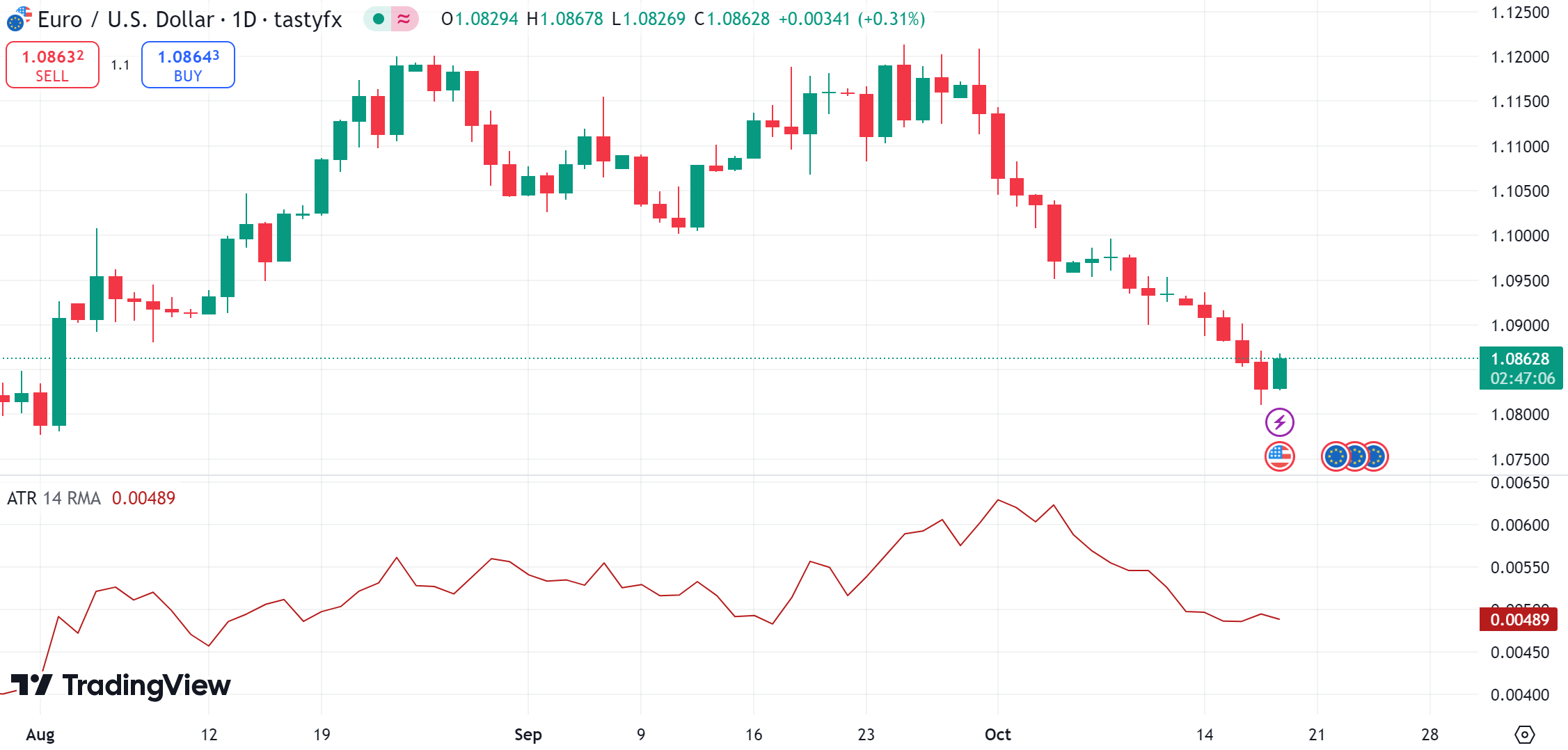
The Average True Range (ATR) is a technical indicator used to measure market volatility. It calculates the average range of price movement over a set period, which helps traders understand how much an asset typically moves.
What is it used for?
ATR can help traders decide where to place stop-loss orders or determine when to enter or exit a trade based on volatility shifts. It is particularly useful in setting trailing stops to protect profits in highly volatile markets. ATR doesn't provide price direction but rather the degree of price movement, making it a useful tool for assessing risk and volatility in trading.
How is it represented?
ATR is represented as a line on a price chart, typically positioned below the main price chart of an asset. This line fluctuates to show the changing levels of market volatility over time.
How is it interpreted?
A high ATR value indicates high volatility, meaning the price of the asset is experiencing larger swings. Conversely, a low ATR value suggests low volatility, with smaller price movements. A sudden increase in ATR might signal a potential breakout or change in trend, prompting traders to adjust their strategies.
6. Stochastic Oscillator
The stochastic oscillator is a momentum indicator used in technical analysis to compare a particular closing price of a security to a range of its prices over a certain period. Developed by George C. Lane in the late 1950s, it is considered a leading indicator that helps predict potential price movements. It measures the speed and momentum of the market, rather than price or volume.
What is it used for?
The stochastic oscillator is used primarily for identifying potential overbought or oversold conditions in a market, which can help traders make decisions about entering or exiting trades.
How is it represented?
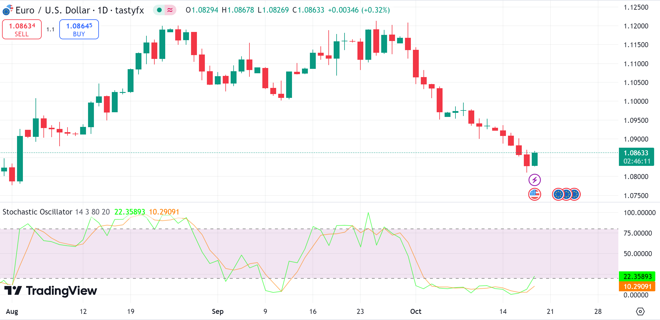
The stochastic oscillator is represented on a chart as two lines that oscillate between levels 0 and 100, typically placed in a separate panel below the main price chart. It provides a visual representation of momentum changes, offering insights into potential market reversals.
How is it interpreted?
The stochastic oscillator is interpreted by analyzing its position and the interaction of its lines relative to certain levels, which helps traders gauge market momentum and potential turning points. When the stochastic oscillator is above 80, it may indicate that the asset is overbought and a price correction could be imminent, suggesting a potential sell signal. When the oscillator is below 20, it might suggest the asset is oversold and could see a price increase, indicating a potential buy signal.
7. Ichimoku Cloud
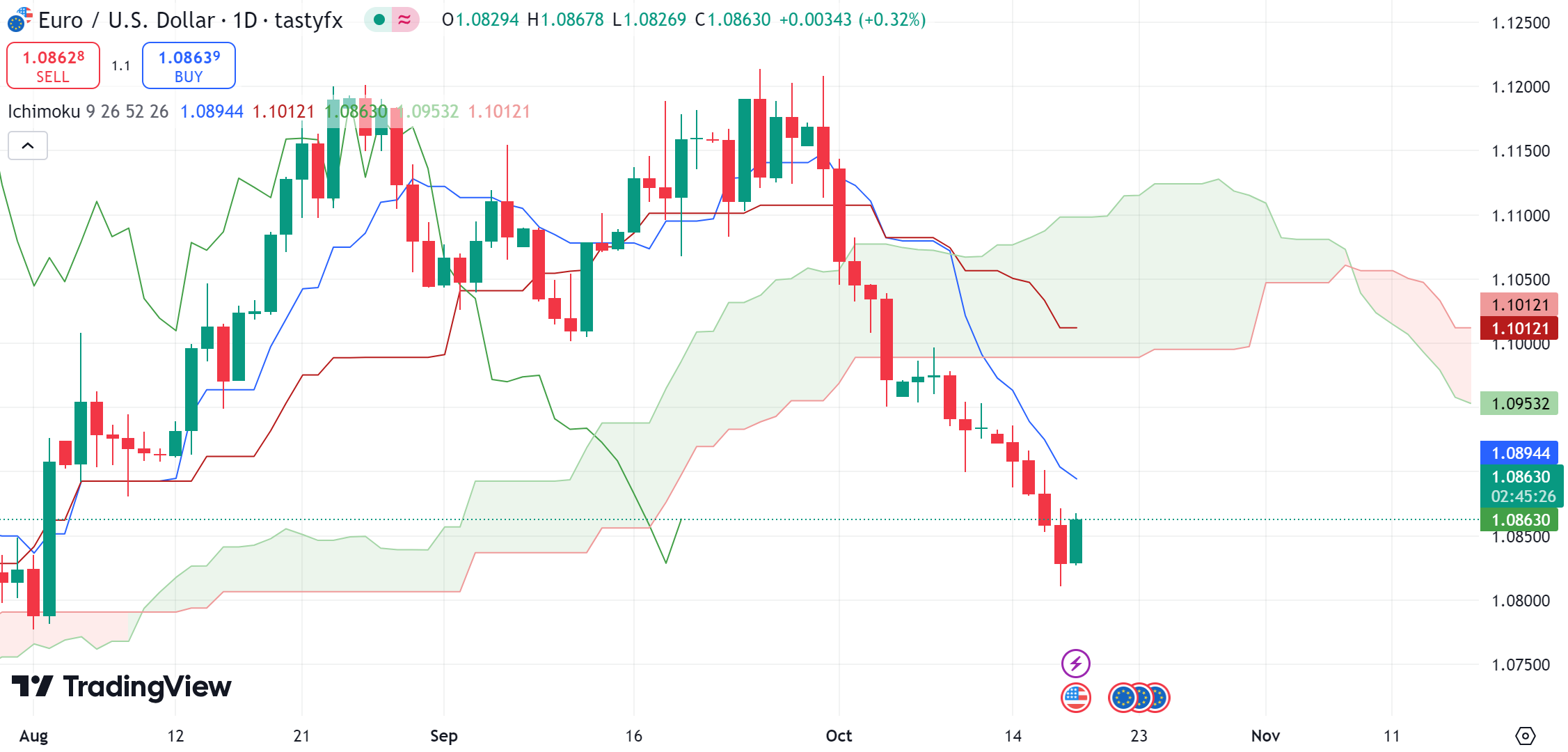
The Ichimoku Cloud is a complex indicator comprising five main components that provide a broader view of the market's potential directions, support, and resistance levels. It incorporates moving averages and other calculations to form a cloud-like region on the chart.
What is it used for?
The Ichimoku Cloud helps traders identify the direction of the trend.
How is it represented?
The Ichimoku Cloud is represented on a price chart with several key components, each providing different insights into market trends and momentum:
Cloud (Kumo): This is the most prominent feature, depicted as a shaded area between two lines: Leading Span A and Leading Span B. The cloud changes color based on which span is higher, indicating potential bullish or bearish signals.
Conversion Line (Tenkan-sen): A short-term moving average, typically calculated over nine periods, shown as a line that tracks short-term trends.
Base Line (Kijun-sen): A medium-term moving average, usually a 26-period average, providing insight into intermediate trends.
Leading Span A: The average of the Conversion Line and Base Line plotted 26 periods ahead.
Leading Span B: Calculated as a 52-period average, also plotted 26 periods ahead, forming the other boundary of the cloud.
Lagging Span (Chikou Span): The current closing price plotted 26 periods back, helping to visualize the price movement relative to past periods.
These components work together to give a comprehensive view of the market’s current trend, potential future direction, and support/resistance levels.
How is it interpreted?
When the price is above the cloud, it indicates a potential uptrend, while a price below the cloud suggests a downtrend. The cloud itself acts as a dynamic support and resistance area. Prices often find support or resistance at the cloud boundaries. The interactions of the lines within the Ichimoku system can create buy and sell signals. For example, a bullish signal is generated when the conversion line crosses above the baseline, and a bearish signal is indicated when it crosses below.
8. Volume Profile
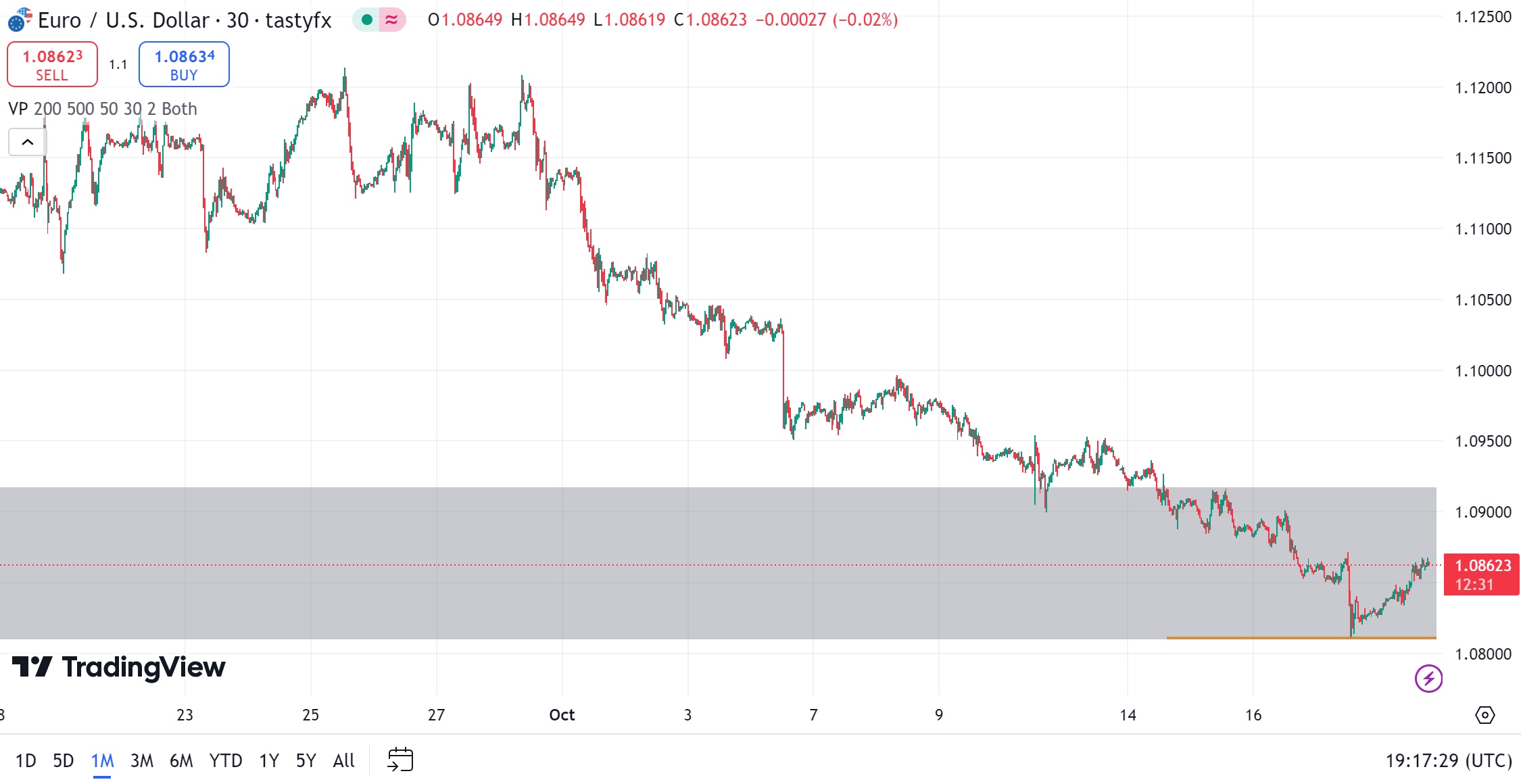
It is a charting tool that plots volume data on a price axis, showing the amount of activity at each price level over a specific period. Unlike traditional volume indicators that display trading volume for a specific time, volume profile provides a graphical representation of volume distribution over price.
What is it used for?
Traders use volume profile to determine optimal entry and exit points based on where the most trading activity occurs. It serves as a confirmation tool to validate trends identified through other indicators. Traders often use the volume profile to set price targets and stop-loss levels, leveraging areas of high activity as potential barriers to price movements.
How is it represented?
Volume Profile is represented as parallel bars. The bars are plotted horizontally, showing the volume traded at each price level. It has a few major components:
Point of Control (POC): This is the price level with the highest traded volume, often marked as a prominent line or color on the chart.
Value Area (VA): This represents the price range where a certain percentage (commonly 70%) of the total volume was traded. It's usually highlighted to show where the majority of trading activity occurred.
High and Low Volume Nodes: These are areas with significantly higher or lower volumes compared to surrounding areas.
How is it interpreted?
High volume nodes often act as strong support or resistance areas because they indicate price levels where significant trading activity occurred, suggesting a greater acceptance of price. The shape of the volume profile can indicate market sentiment. For example, a profile with high volume at lower prices might signal accumulation, while high volume at higher prices could indicate distribution. By observing how the volume is distributed, traders can identify potential trends and reversals. A shift in the POC, for example, may signal a change in market sentiment.
9. Pivot Points
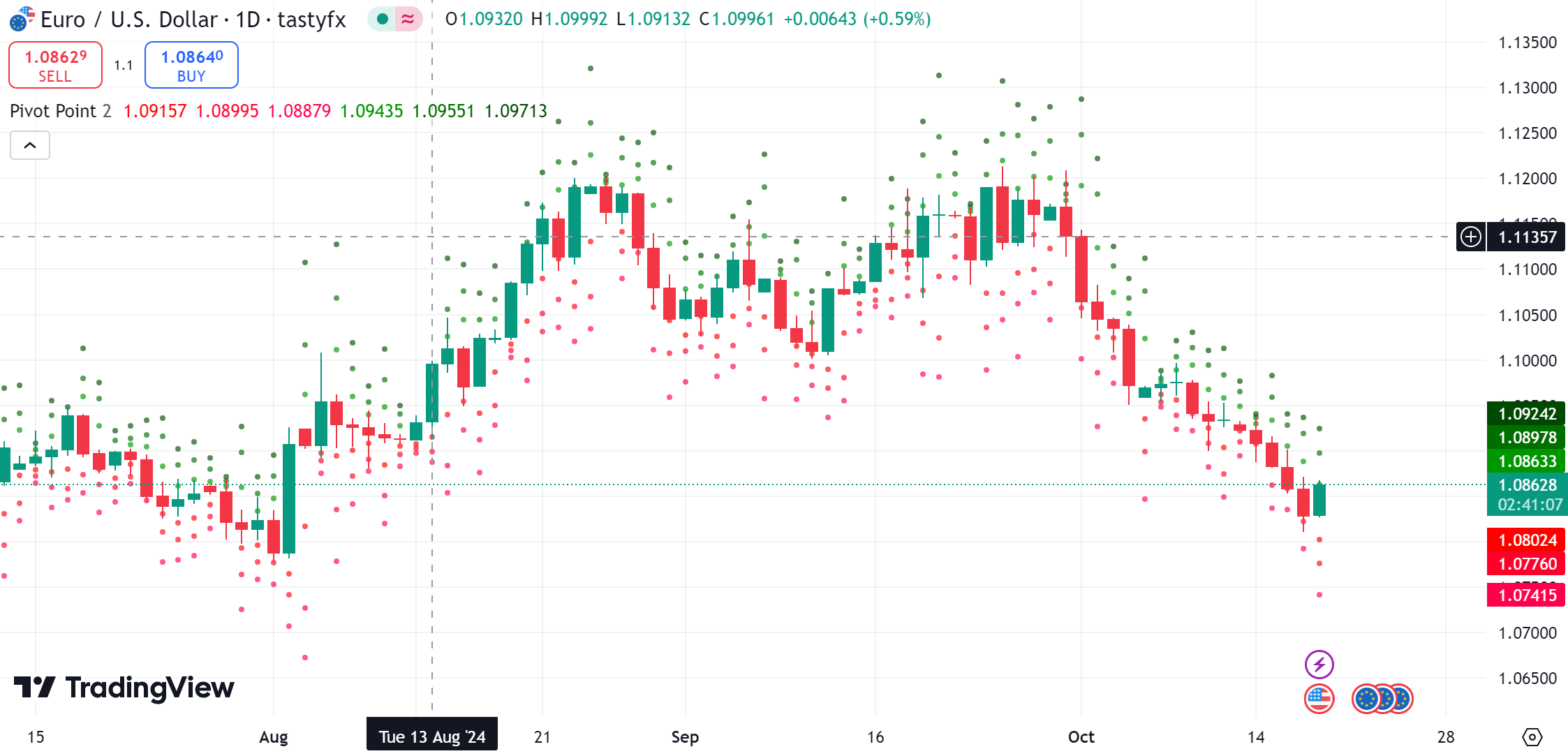
Pivot points are indicators used by traders to determine overall market trends over different time frames. They provide potential support and resistance levels, helping traders identify possible turning points in the market.
What is it used for?
Pivot points are primarily used by day traders to identify price levels that might function as support or resistance throughout the trading day. Traders often use pivot points to establish entry and exit points for their trades. The direction of the pivot point relative to the current price can help confirm the trend direction for short-term trading strategies.
How is it represented?
Pivot points are represented on a price chart with a main pivot point (PP) line and additional support (S1, S2) and resistance (R1, R2) lines. These horizontal lines serve as potential levels where the price might encounter support or resistance.
How is it interpreted?
If the price is above the pivot point, it is typically interpreted as a bullish signal; if below, it is considered bearish. If a price breaks through a pivot level, it may indicate stronger momentum in the direction of the breakout, either continuing a trend or starting a new one.
10. Moving Average
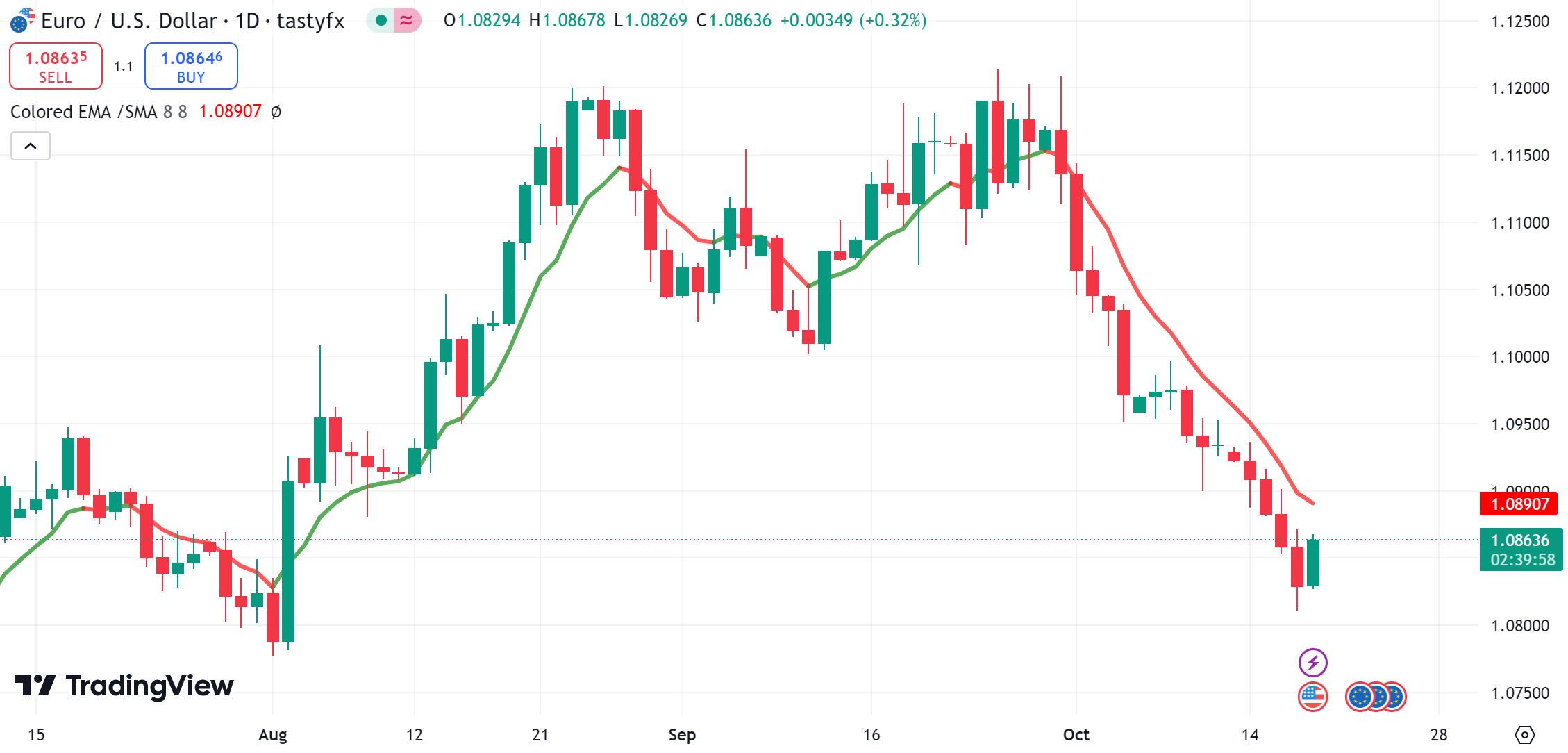
Moving averages are a widely used technical analysis tool that smooths out price data by creating a constantly updated average price over a specific period. This helps traders reduce noise and better identify the direction of a trend.
There are different types of moving averages, including:
Simple Moving Average (SMA): The arithmetic mean of past prices over a set period, plotted on the chart.
Exponential Moving Average (EMA): Places more weight on recent prices, making it more responsive to new information.
What is it used for?
Moving averages help traders identify the direction of a trend by smoothing out price fluctuations. They can act as dynamic support or resistance levels, where prices may bounce off. Moving averages are used to generate buy and sell signals, often in conjunction with other indicators.
How is it represented?
Moving averages are represented on a price chart as a line that follows the price movements of an asset.
How is it interpreted?
Trend Direction:
Upward Sloping: Indicates a potential uptrend, suggesting bullish sentiment.
Downward Sloping: Signifies a possible downtrend, indicating bearish sentiment.
Crossovers:
Golden Cross: Occurs when a short-term moving average crosses above a long-term moving average, potentially signaling a buy opportunity.
Death Cross: When a short-term moving average crosses below a long-term moving average, it may suggest a sell opportunity.
Support and Resistance:
Prices may find support at a moving average during an uptrend or resistance during a downtrend, providing potential entry or exit points for trades.
Concluding the Essential Role of Trading Indicators
Trading indicators are essential tools that empower traders by providing insights into market trends, potential entry and exit points, and overall market conditions. From the Relative Strength Index (RSI) to Moving Averages and Bollinger Bands, these indicators use mathematical calculations to turn complex market data into understandable visuals on price charts. By leveraging tools like those available on TradingView, traders can enhance their decision-making processes and refine their strategies. Past performance is not indicative of future results.
Information provided may not be appropriate for all investors and is provided without respect to individual investor financial sophistication, financial situation, investing time horizon or risk tolerance. Please review the Risk Disclosure before trading. Forex trading involves risk. Losses may exceed deposits.
